It may sound bizarre to talk about content when discussing where best to place screens for maximum impact, but where you decide to place your screens should have a bearing on content and vice versa. Let’s look at a few tips for content production best practises: –
When a sign is located in for example a busy corridor, viewers are likely to see the screen only momentarily as they pass by. Their attention is fleeting and you cannot guarantee at what point in a rotation you may catch their attention. This viewing pattern is best for single, very simple messages that rotate in order to attract attention. However when a sign is located in a reception area, by an elevator, near a service desk—anyplace where people are expected to wait for a bit of time—you have more freedom with content. This viewing pattern lends itself to longer messages.
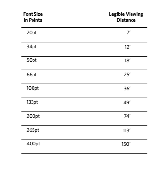
You also need to ensure that any text used is preferably in a sans serif typeface and has a high contrast with the background colour so that it is clearly legible. Also keep text to a minimum and never have paragraphs and paragraphs of text that no-one will read. Also the size of the typeface should be large enough to be easily read from the furthest extremities of your catchment area – try some sample once the screen is up to find the optimum size for text.
But despite all the above, what the vast majority of people forget when creating content for screens is the ‘call to action’, i.e. what is it you want viewers to do once they have been engaged by your content? If you do not know then assume the viewer does not know either.


