 Your latest high tech digital signage equipment will be worthless unless time and effort is put into planning the precise location of your displays before installing them.
If they are not installed in places that people can see them then your messages will be wasted.
It is critical to ensure that you understand how your customers, patients, employees, students etc navigate the space and the specific ways that they will engage with the displays.
Ensure that users have a direct line of site and that they will have the time to receive the information that is being delivered, meaning that they will see it.
Where possible plan the display installations to be aesthetically pleasing and in with the design of the building. Don’t just place it on a wall, try to make it fit into its surroundings.
Ensure that you also fit the correct size of the display for the location ensuring that you get the viewing distances correct. Screens information, especially text ,needs to be legible so people can read it.
- Use a font size of at least 16 points for your main body text. Anything smaller is too hard to read.
- Stick with traditional fonts like Arial, Times New Roman, or similar typefaces.
- Use italics or bold for emphasis, not for all your text.
- Don’t place your text on top of a picture; that makes it difficult to read.
- Don’t use ALL CAPS; THEY ARE MUCH HARDER TO READ.
- Don’t use reverse type (white text on a dark background). It is hard to read. Use black characters on a white (or pastel) background.
- Don’t use Artistic fonts as They are much harder to read.
- Don’t use more than two or three different fonts
Viewing distances
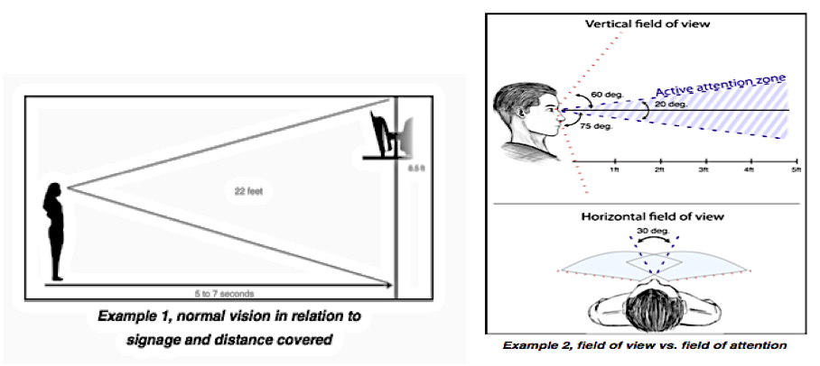
An average person with 20/20 vision can accurately see and read text a few inches tall on a display 20 to 25 feet away. (See example 1)
People approaching a screen 20-25 feet away will take approximately 5- 7 seconds to reach it
As person`s vertical field of view is generally 75 degrees below eye level and 60 degrees above eye level (see example 2)
A person`s field of attention is generally only 20 to 25 degrees of the field of view
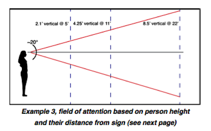
Viewing Heights and Angles
From 5 feet away, the field of attention is within 2 feet of eye level (see example 3)
From 10 feet away , the field of attention is 4 feet of eye level (see example 3
From 20 feet, the field of attention is within 8.5 feet of eye level (see example 1 and 3 )
This not an exact science, however, if we assume the average height of our audience is 5`5” and we assume that they have normal vision, from 20 feet away the field of attention is 8.5 feet higher than they are tall. Field of attention plus the persons height (8.5+5.5=14). This means that the display should generally never be mounted more than 14 feet off the ground.
Mounting the display above 14 feet with a slight angle downwards, may fall into the field of attention for taller people but in this example our average person would need to be nearer to the screen to read it. Also the higher you go the greater the risk to falling out of the field of attention for most viewers
Larger displays are best as they are more effective in grabbing a person`s attention.
Remember you only have 5-7 seconds to get your message across and dependent on the vision of the viewer and the speed at which they walk this time could reduce to 2-4 seconds.
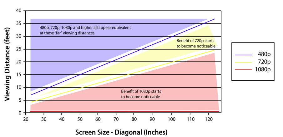
Resolution is also important to ensure that your messages are delivered a in quality high-resolution format. It’s no use spending time and effort to create something wonderful and eye catching for the quality of display to let it down.
The resolution becomes more apparent the large the screen that you use. Screens of 20 inches for example may only need a low resolution of say 480P. However try to use this resolution on a larger 47” screen and your content will be seriously affected and will look poor. Use a resolution of say 1080p to ensure a crisp and clear image.
If you’re just getting started on digital signage or you want to improve your current network, we have a range of free whitepapers ready for you to download.

